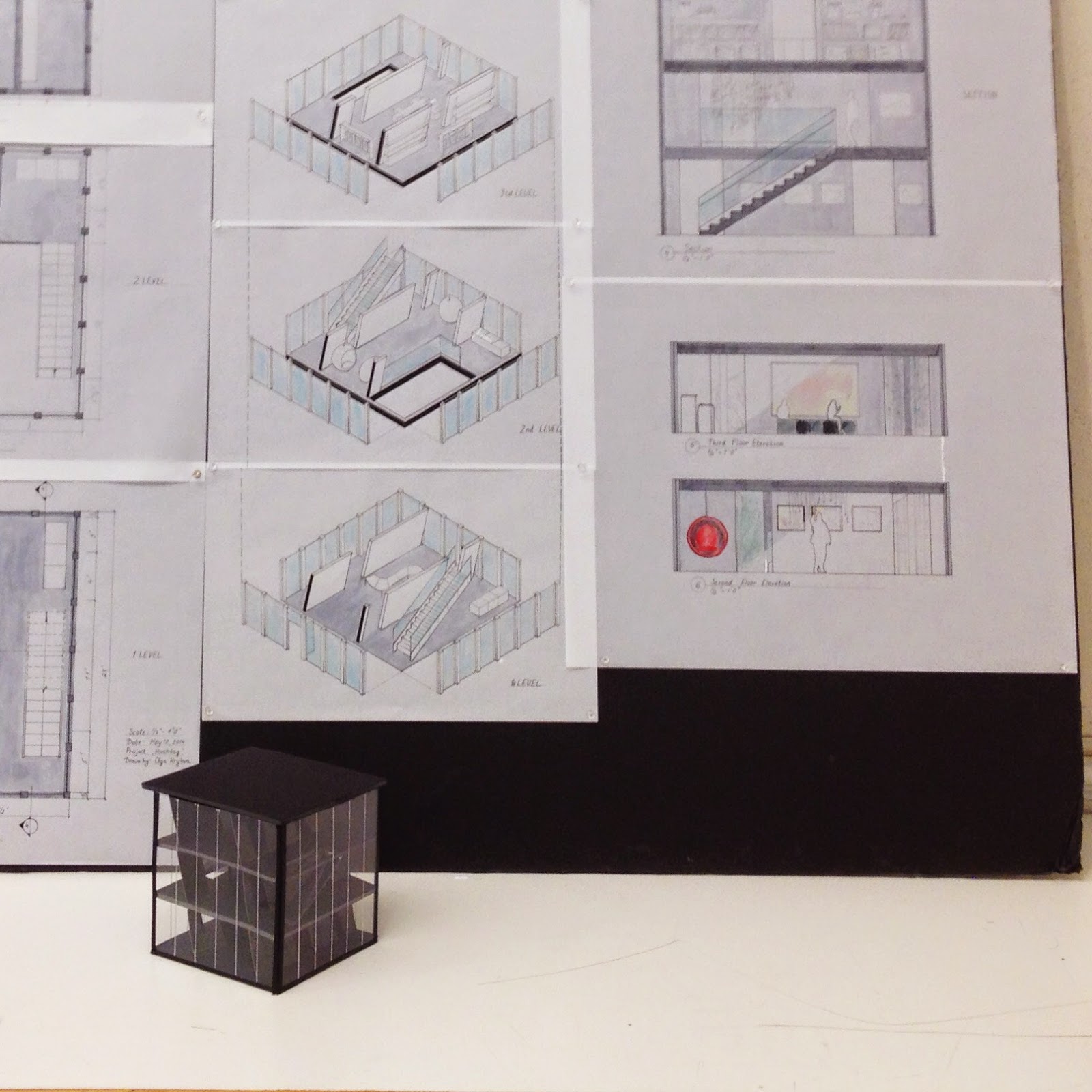
Sometimes it is good to look back. I wanted to post the project that I've done over last semester. The assignment was to create a folly building 10'*10' inspired by particular typeface. My typeface was Didot. First we did the study of the typeface, than created a model, drawings, revised model, revised drawings, and final drawings. I also designed a hashtag bench. Too much Instagram perhaps ;)
Didot typeface is extremely stylish and nowadays used by famous magazines and design brands. I see my space located in the Art/Fashion District. It serves the purpose of art gallery as well as just public
place of rest. “Hashtag” has a great shape to play with, and I was interested,
how would it felt to move along the strokes. Didot typeface gives me the
feeling of something modern, linear, and neat. I think it also can be seen in my building's interior and exterior. My building is a structural play with a
dash of irony to the modern society and itself.
#


No comments :
Post a Comment